 大前端
大前端05: CSS如何进行圣杯布局
圣杯布局如图:
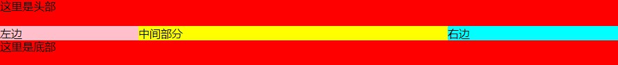
而且要做到左右宽度固定,中间宽度自适应。
1.利用flex布局
html
<!DOCTYPE html>
<html lang="en">
<head>
	<meta charset="UTF-8">
	<title>Document</title>
	<style>
    *{
      margin: 0;
      padding: 0;
    }
    .header,.footer{
      height:40px;
      background:red;
    }
    .container{
      display: flex;
    }
    .middle{
      flex: 1;
      background:yellow;
    }
    .left{
      width:200px;
      background:pink;
    }
    .right{
      width:300px;
      background: aqua;
    }
	</style>
</head>
<body>
  <div class="header">这里是头部</div>
  <div class="container">
    <div class="left">左边</div>
    <div class="middle">中间部分</div>
    <div class="right">右边</div>
  </div>
  <div class="footer">这里是底部</div>
</body>
</html>
2.float布局(全部float:left)
html
<!DOCTYPE html>
<html lang="en">

<head>
  <meta charset="UTF-8">
  <meta name="viewport" content="width=device-width, initial-scale=1.0">
  <meta http-equiv="X-UA-Compatible" content="ie=edge">
  <title>Document</title>
  <style>
    *{
      margin: 0;
      padding: 0;
    }
    .clearfix::after{
      content: '';
      display: block;
      height: 0;
      visibility: hidden;
      clear: both;
    }
    .header,
    .footer {
      height: 40px;
      width: 100%;
      background: red;
    }

    .container {
      padding-left: 200px;
      padding-right: 300px;
    }

    .container div {
      float: left;
    }

    .middle {
      width: 100%;
      background: yellow;
    }

    .left {
      width: 200px;
      margin-left: -200px;
      background: pink;
    }

    .right {
      width: 300px;
      margin-right: -300px;
      background: aqua;
    }
  </style>
</head>

<body>
  <div class="header">这里是头部</div>
  <div class="container clearfix">
    <div class="left">左边</div>
    <div class="middle">中间部分</div>
    <div class="right">右边</div>
  </div>
  <div class="footer">这里是底部</div>
</body>

</html>
3.float布局(左边float: left, 右边float: right)
html
<!DOCTYPE html>
<html lang="en">

<head>
  <meta charset="UTF-8">
  <meta name="viewport" content="width=device-width, initial-scale=1.0">
  <meta http-equiv="X-UA-Compatible" content="ie=edge">
  <title>Document</title>
  <style>
    *{
      margin: 0;
      padding: 0;
    }
    .header,
    .footer {
      height: 40px;
      width: 100%;
      background: red;
    }
    .container{
      overflow: hidden;
    }

    .middle {
      padding: 0 300px 0 200px;
      background: yellow;
    }

    .left {
      float: left;
      width: 200px;
      background: pink;
    }

    .right {
      float: right;
      width: 300px;
      background: aqua;
    }
  </style>
</head>

<body>
  <div class="header">这里是头部</div>
  <div class="container">
    <div class="left">左边</div>
    <div class="right">右边</div>
    <div class="middle">中间部分</div>
  </div>
  <div class="footer">这里是底部</div>
</body>

</html>
4. 绝对定位
html
<!DOCTYPE html>
<html lang="en">

<head>
  <meta charset="UTF-8">
  <meta name="viewport" content="width=device-width, initial-scale=1.0">
  <meta http-equiv="X-UA-Compatible" content="ie=edge">
  <title>Document</title>
  <style>
    *{
      margin: 0;
      padding: 0;
    }
    .header,
    .footer {
      height: 40px;
      width: 100%;
      background: red;
    }
    .container{
      min-height: 1.2em;
      position: relative;
    }

    .container>div {
      position: absolute;
    }

    .middle {
      left: 200px;
      right: 300px;
      background: yellow;
    }

    .left {
      left: 0;
      width: 200px;
      background: pink;
    }

    .right {
      right: 0;
      width: 300px;
      background: aqua;
    }
  </style>
</head>

<body>
  <div class="header">这里是头部</div>
  <div class="container">
    <div class="left">左边</div>
    <div class="middle">中间部分</div>
    <div class="right">右边</div>
  </div>
  <div class="footer">这里是底部</div>
</body>

</html>
5.grid布局
html
<!DOCTYPE html>
<html lang="en">

<head>
  <meta charset="UTF-8">
  <meta name="viewport" content="width=device-width, initial-scale=1.0">
  <meta http-equiv="X-UA-Compatible" content="ie=edge">
  <title>Document</title>
  <style>
    .header,
    .footer{
      width: 100%;
      height: 80px;
      line-height: 80px;
      text-align: center;
      background-color: #f00;
    }
    .container{
      display: grid;
      grid-template-columns: 200px auto 300px;
    }
    .middle {
      background: yellow;
    }

    .left {
      background: pink;
    }

    .right {
      background: aqua;
    }
  </style>
</head>

<body>
  <div class="header">这里是头部</div>
  <div class="container">
    <div class="left">左边</div>
    <div class="middle">中间部分</div>
    <div class="right">右边</div>
  </div>
  <div class="footer">这里是底部</div>
</body>

</html>
看看grid布局,其实也挺简单的吧,里面的参数应该不言而喻了。
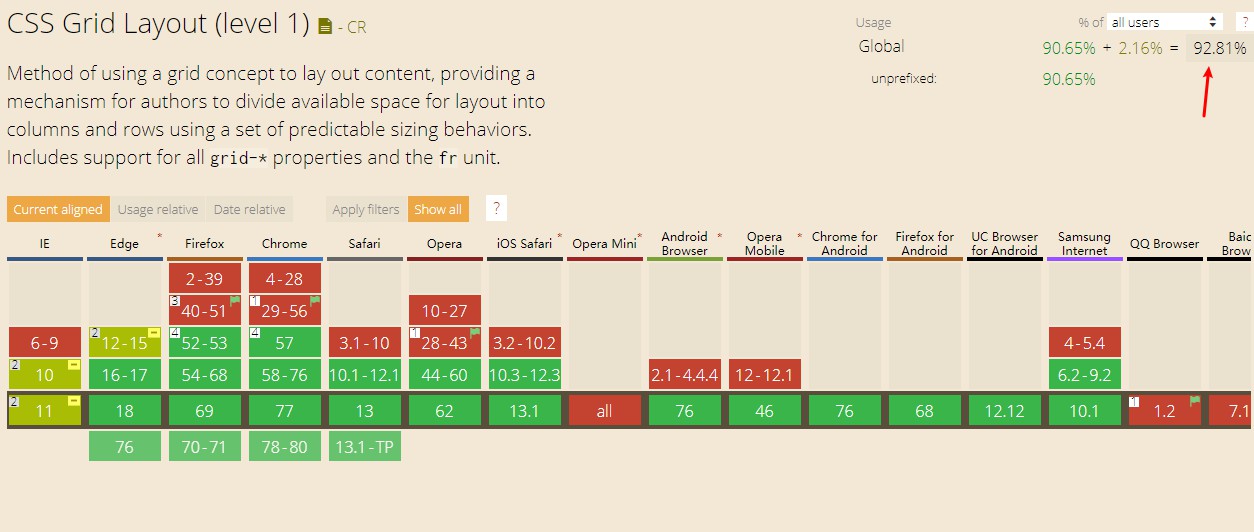
另外说一点,到2019年为止,grid现在绝大多数浏览器已经可以兼容了,可以着手使用了。
当然,还有table布局,年代比较久远了,而且对SEO不友好,知道就可以了。